Introduction to Statistics - the goal of this mindmap is to serve as an introduction to statistics for elementary teachers.
Statistical Diagrams: If they are created properly, can present data in a clear, concise, and visually pleasing way. Staistical Diagrams help to make sense of data - to summarize and compare them. There are many ways to visually organize data.
Dot Plot

Used when have relatively small data sets. Example - number of brothers and sisters of students in a class.

Stem and Leaf Plot
Used for small sets of data. Often helpful when comparing two sets of data.

Example: The age of a group of shoppers at the mall.
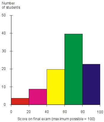
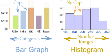
Histogram
Used to summarize large sets of data into groups or consistent intervals.
Bar Graph
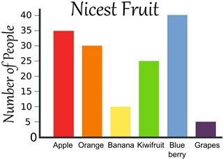
Be careful that your bars don't touch!

Subtopic
Subtopic
Line Graph
Pie Graph
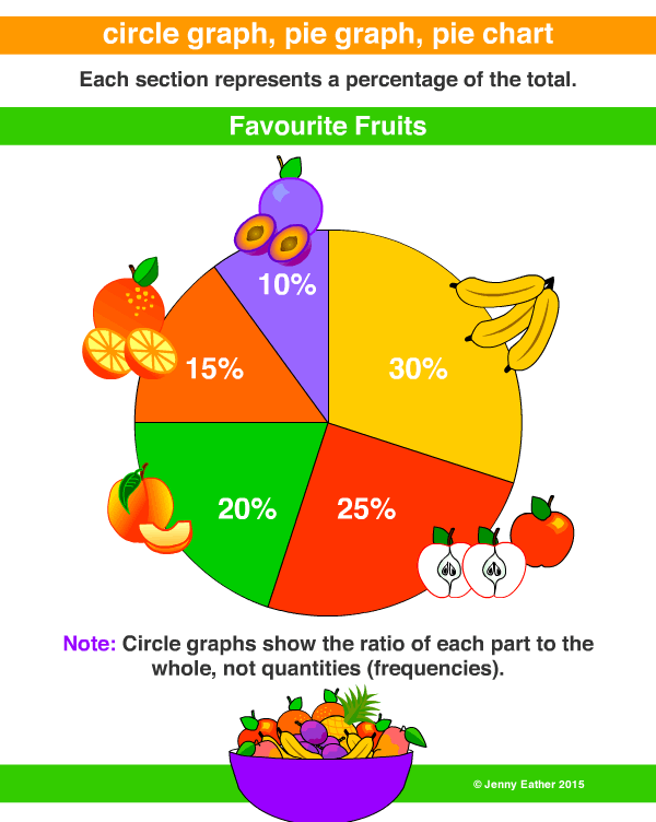

Use pictures to represent non-numerical data. Be sure to include a clear description of what the picture represents

Statistical Inference
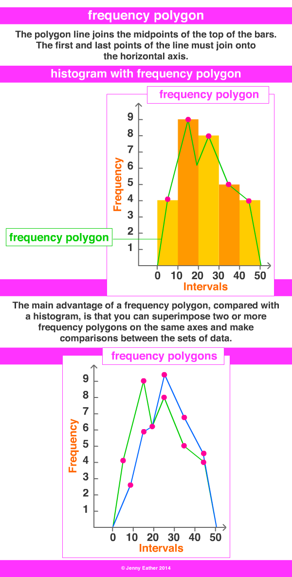
Relative Frequency Polygon
Normal Distribution
z-score: A standardized score. Provides information on how accurage the observation is. It is fair, quite good or rather poor. Used when have a sample to describe a characteristic of a population.
Percentile: represents the percentage of data that is less than or equal to the percentage. Use z-scores to find the percentile.
Measures of Center
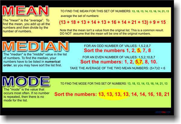
Measures of Center
Mean: the average value
Median: the middle value after data is placed in increasing order
Mode: the most common value
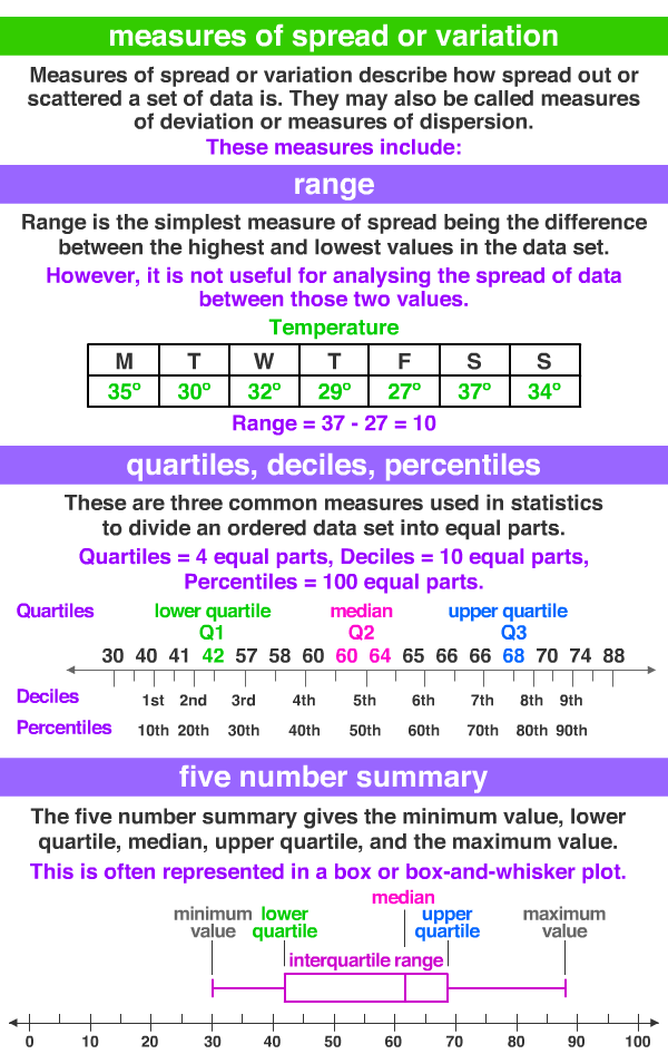
Range: highest data value - lowest data value
Measures of Spread or Variability
Standard Deviation: the typical deviation of the values from the mean. Step 1: Find the mean. Step 2: for each point, find the square of the difference between the point and the mean (ex. (mean - first point)^2....). Step 3: Find all the squares in step 2. Step 4: Divide your answer from Step 3 by n. Step 5: Take the square root of your answer from Step 4.
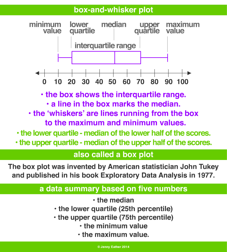
Box Plots with Quartiles
Range