Data management
Graphs
Bar graphs

A bar graph is used to compare data
Picto graph
A picto graph uses pictures to compare data
Line graph
A line graph is used to show change over time
Scatter plot
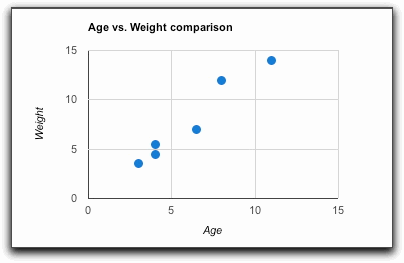
A scatter plot shows the type of relationship that exists between two sets of data
Circle graph
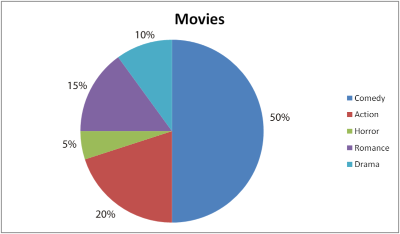
A circle graph represents data in a percentage or in a whole
Stem and leaf plot
A stem and leaf plot orders data by using place values
Double bar graph
A double bar graph uses data to compare two sets of data
Line plot
A line plot shows numbers on a data line and shows frequency
Mean,Median,Mode and Range
Mean
The mean is the sum of a set of numbers divided by the number of numbers in the set. (The average)
Ex. 10+3+5+8+2=28÷6=4.6
Median
The median is the middle number when the data is arranged in a numerical order.
Ex. 1,5,6,7,7,8,9=7 is the median
Mode
The mode is the number that occurs the most often in a set of numbers.
Ex. 1,1,2,3,3,5,6,6,6,6,7,7,7,8=6 is the mode
Range
The range is the difference between the greatest and least numbers in a set of data or the lowest to highest number.
Ex. 1,3,6,5,9,7,2= 1) 9-1=8 2) 1-9