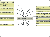
Logo Design Process
Exact name you would like to be used in your logo
Awe: Kinaesthetic Personal Training
Website address, if applicable
Kinaesthetic
What is the tagline, if any?
feel, look and move...better.
Specifically describe your field of business:
art, science, philosophy of fitness
What or who is your target clientele?
busy professionals 18-60 and their children
What colors would you like to use in your logo?
black, white and red
Do you want your logo to be text only, graphic only, or text and graphic together?
text and graphic
Your preferred font style is:
perpetua
List 3 different items you see being used to represent your company, ie. person running, kettlebell, med ball, etc.
uniqueness of snow, snowboarders, surfers, skaters,/bikers,
Anything you do not want to see in your logo?
nothing cheesy, must be have a high end aesthetic, it is what I am selling: Taste.
Be prepared to find reference images for logos you do like
japanese natural crests: snow
Who are your competitors and what do you think about their logos?
Hanson Fitness
Have seen the brand grow, very cheezy but he attracts all the right clients. His site is now black and cooler(ish)
Equinox
High end brand but too commercial, good understanding of magic and science of branding.
TBD
What should come to your customers mind when they see your logo?
cool, edgy, unique professional empowerment
Describe any ideas that come to mind for your new logo:
japanese natural crests: snow repesenting something hot and cool, unique and I am an avid snowboarder
Decribe any special type of graphic/icon you desire:
I like to evoke imagery from twilight as my customers are typically the same demographic and they either want to be badass vampires or warewolves or at least look like Jacob.
