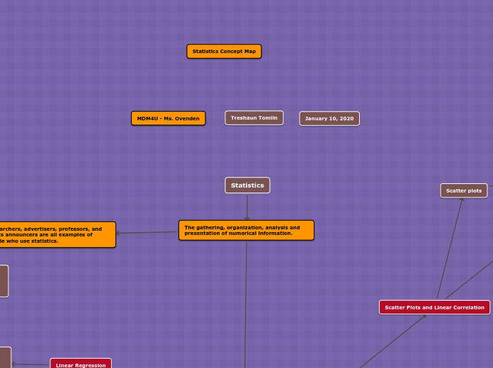
Researchers, advertisers, professors, and sports announcers are all examples of people who use statistics.
Ways to organize, analyze, and present the information in an understandable form.
The quantity being measured is the variable.
A continuous variable can have any value within a given range
A discrete variable can have only certain separate values
it is useful to know how frequently the different values of a variable occur in a set of data.
Histogram is a special form of bar graph in which areas of bars are proportional to frequencies of the values of the variable
A frequency polygon can illustrate the same information as a histogram or bar graph.
Relative-frequency table or diagram shows the frequency of data group as a fraction or percent of whole data set
Categorical data are given labels rather than being measured numerically.
Pie Graphs are often used instead of bar graphs to illustrate categorical data
Pictographs serve the same function as (pie charts).
An index relates the value of a variable (or group of variables) to a base level
Base level is set so that the index produces numbers that are easy to understand and compare.
Consumer price index (CPI) is the most widely reported of these economic indices because it is a significant measure of inflation.
Inflation is a general increase in prices, which corresponds to a decrease in the value of money.
Sampling Techniques
Population (refers to all individuals who belong to a group being studied)
Sample (Is as a sub-unit of a population)
Sampling bias
Non-response bias.
Measurement bias
Measures of Central Tendency
It is often convenient to use a central value to summarize a set of data.
Scatter Plots and Linear Correlation
Dependent/response variable
Variables have a linear correlation (proportional changes to one another)
Also regarded as perfect positive or direct linear correlation
Scatter plots
Shows relationships graphically with the use of line of best fit
Linear Regression
Regression is an analytic technique for determining the relationship between a dependent variable and independent variable.
When two variables have a linear correlation, you can develop a simple mathematical model to find the line of best fit.
Interpolation
Extrapolation
Least-squares fit
Non-Linear Regression
Analytical technique for finding a curve of best fit for data from relationships
Typed of regressions
Exponential regression
Power regression
Polynomial regression
Cause and Effect
Main reason for a correlational study is to find evidence of a cause-and-effect relationship
A change in a variable, X, produces a change in another variable, Y.
Types of Cause-Effect
Common-Cause Factor
Reverse Cause-and-Effect Relationship
Accidental Relationship
Presumed Relationship
Extraneous variables
Extraneous means external rather than irrelevent
In order to reduce effect of extraneous variables, researches often compare an experimental group to a control group.
Critical Analysis
Is the sampling process free from intentional and unintentional bias?
Has causality been inferred with only correlational evidence?