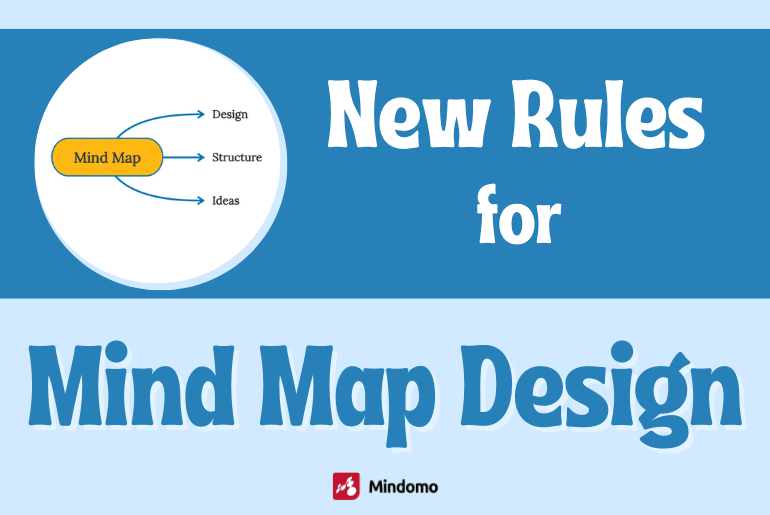
Before mind mapping software was available, there were “rules” about how to design Mind Maps for studying and memorization. The rules included using only one word per branch and using plenty of color and images.
A mind map maker is now used in a wide range of settings for an even wider range of purposes. Project management, working collaboratively, and writing business plans or a marketing strategy are well beyond the original design concepts. There are also fundamental differences between drawing on paper and using an electronic workspace, such as the ability to drag and drop to change the meaning. The new “rules” for Mind Map design are very different now.
Much of the current advice about map design focuses on a mind map as an image, ignoring more critical factors. Many people choose mind map templates for their appearance alone. Attractive graphics are important, but there is much more behind the design of a successful mind map.
How do I “design” a mind map?
One of the most valuable features of mind map maker software is that you can start anywhere. You don’t need a plan or a design for your map. Just start with a central topic in a brainstorming mind map, and it will take on a shape of its own. As you write down your thoughts, they will begin to flow as you connect ideas together.
But to go beyond a brainstorming mind map to something that achieves a goal, you need to clarify that goal and how the map supports it. Every map has a purpose and can succeed or fail.
The “design” of your map is separate from its contents. Contents and design are equally important. You might have some great ideas and information, but the map design does not help you to use it. Or, you might have a great design, but the contents may be lacking. That is a good place to be because a good design can help you keep moving towards your goal.
When designing mind maps, you can choose:
- The graphical appearance of the map
- How to use the working space to represent ideas
- How to organize information on the map
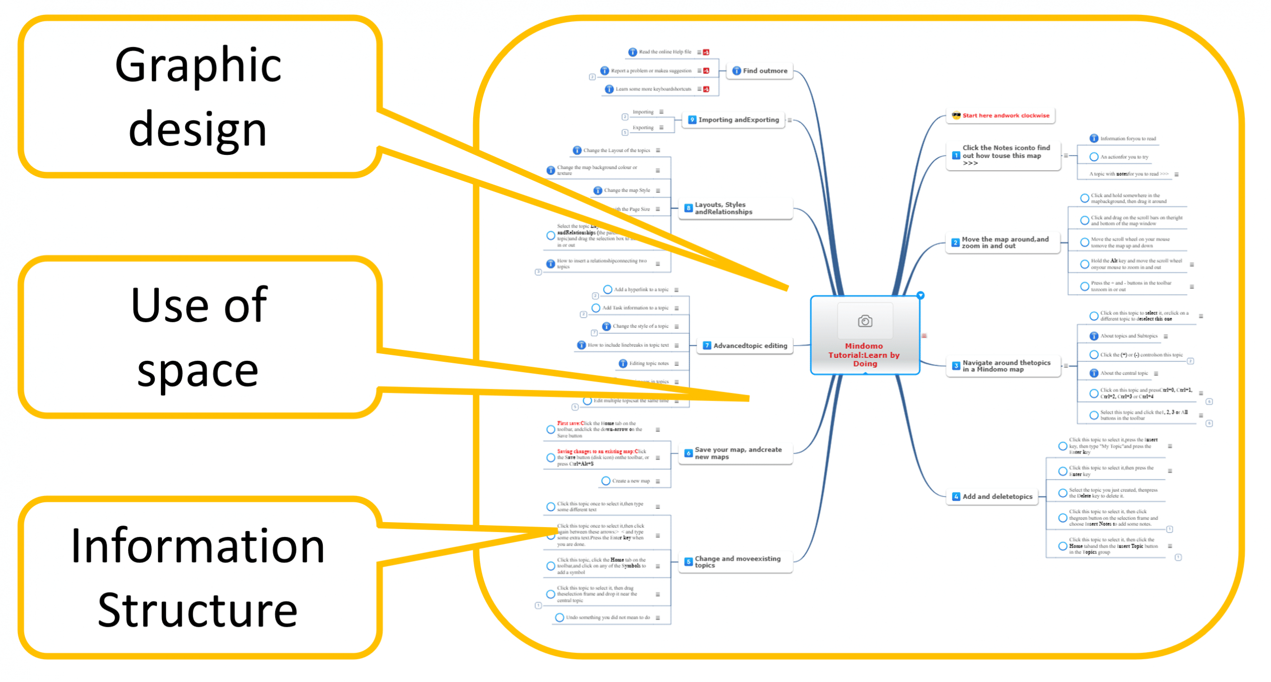
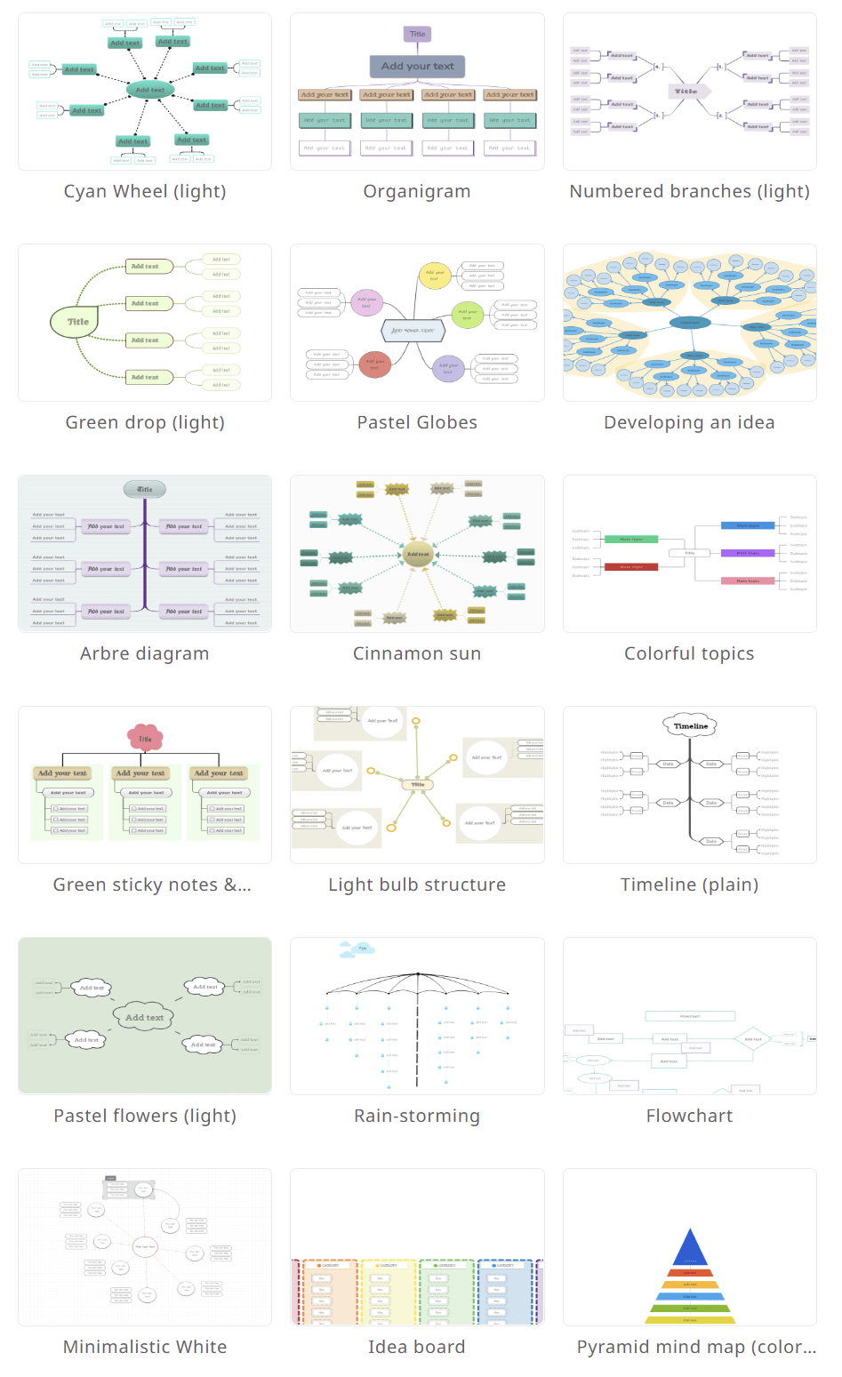
These are things that mind map templates can help with, so it is always worth looking through the templates to see what is already available.
Graphical appearance
First impressions count, even if you are working alone. If your map is a mess, you will not enjoy working with it very much. If you show it to someone else, you might even do more harm than good.
Start by thinking about your audience. If you are working in an organization, a graphical design that reflects your organization will give a professional appearance. Many organizations have a “style manual” that will give you logos, colors, and fonts to use. When your colleagues see the company logo in the central concept, they will assume it has a business purpose and will approach it with a different mindset.
Mind map templates often cover a wide range of graphic themes, but if you need to plan projects with colleagues or clients, a neutral design will work best. Avoid distractions that don’t add meaning to your map.
For personal mind map ideas, even just a map to plan your social media posts, you should still create a mind map that you would be happy to share with others. A clean and tidy workbench always produces better work.
Using the working space
If you have been using mind mapping for a while, you might have a feeling that mind maps are not like other diagrams. Nobody raises an eyebrow if you use pie charts, bar charts, grids, or block diagrams. However, mind maps sometimes cause people to frown because they work in a different way. Using a mind map to visually organize your ideas is a design choice.
Most diagram types use two dimensions to convey information. The horizontal dimension is typically used to represent sequence or order, typically from left to right. The vertical dimension often represents importance or value, with the highest values at the top and lower values further down.
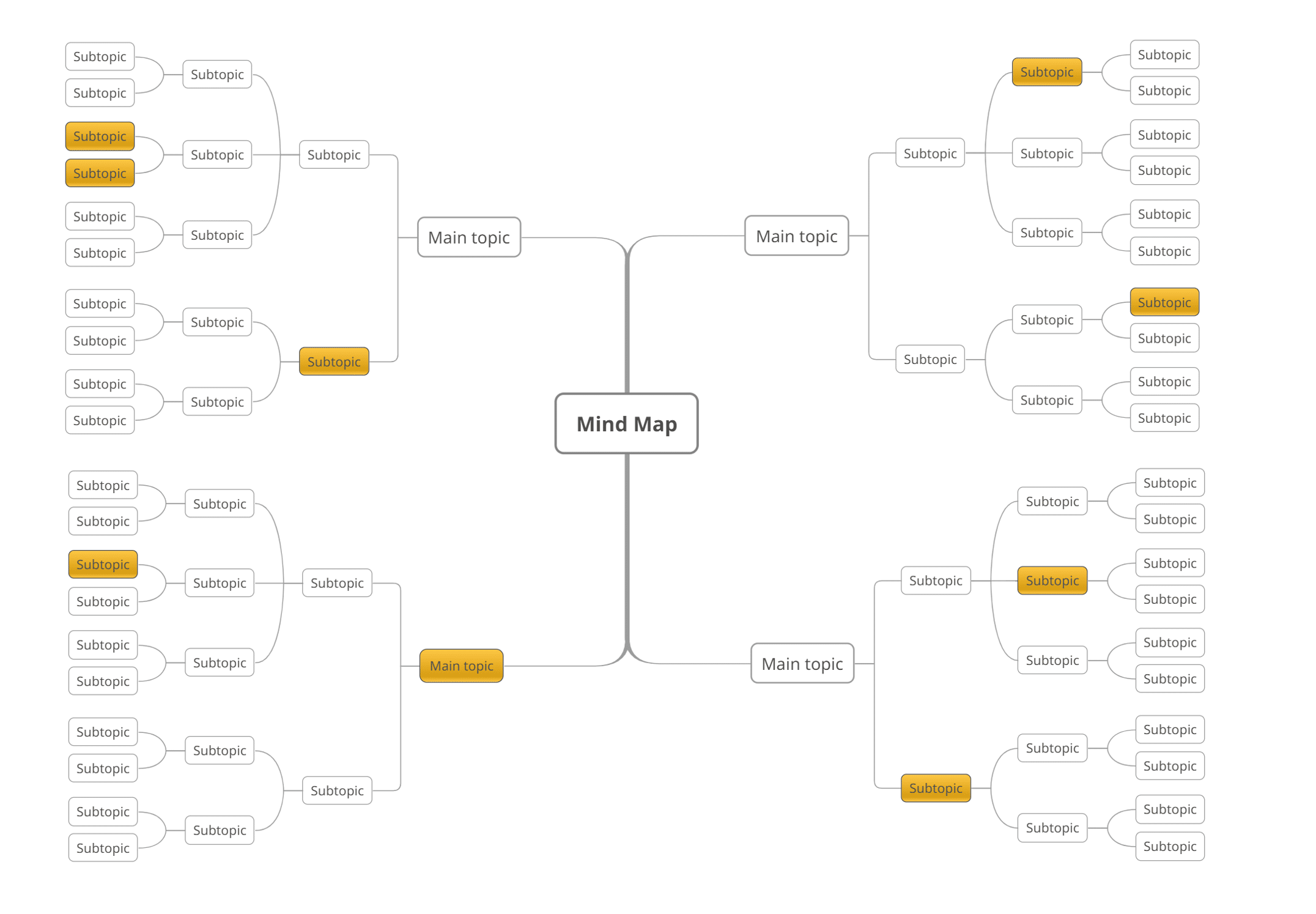
Mind maps also use two dimensions, but unlike other diagrams, they are “polar” dimensions. The location of a topic in a mind map is described by its direction and distance from the central idea. The direction from the center defines the subject or context. The distance from the central idea usually reflects the importance in terms of the level of detail. The level of detail tells you whether this is a big idea or a smaller part of another one.
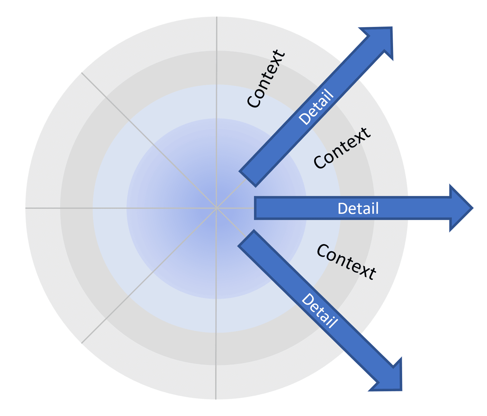
This “polar” layout makes a big difference compared to other diagrams. Mind maps can be as big as you like. Adding more detail to a regular diagram can make it harder to read. Adding more detail to a mind map just makes it bigger, not harder to use.
Mind maps allow you to draw and manipulate meaning based on context and importance. The best mind maps are designed so that the most important ideas are close to the central concept. You can communicate your key ideas by looking at a small map with most of the details hidden. This is a powerful way to organize information of any kind.
For an effective design of a mind map, you must choose the most critical aspects of the subject and get them close to the central idea. This connects directly with your objectives. For example, business plans should clearly state the primary goals of the business because these will be your top priority. If objectives are buried in a place where only you can find them, then they won’t set the context for decisions and actions. Similarly, a map for a marketing strategy should have the key metrics in view near the center. A project management map should have the project outcomes so that everyone can see them.
When adding something to the map, think about where it best fits and how important it is in that area of the map. Even if your key objectives are not clear to begin with, you can easily drag and drop topics to reorganize your map as things get clearer. But try to get this done early before the map gets too big.
Use color, images, and icons in your mind map design
A challenge faced by almost everyone who tries to create a mind map (learn how to make mind map) is what to do when something belongs in two places at the same time. For example, if you have a topic for “pets” and a topic for “cats”, your pet cat belongs to both.
There are a couple of ways to avoid this in your design.
First, try to make the children of a topic mutually exclusive to each other and non-overlapping. “Cats” and “dogs” are mutually exclusive, as there aren’t any cats that are also dogs. “Cats” and “Pets” are not exclusive, and the overlap will cause an issue at some point.
Another approach is to use mutually exclusive groupings in the structure of your map, then use icons, shapes, and colors to connect ideas across the map. Continuing with the previous example, you could have branches for “cats” and “dogs”, then mark “pets” with an icon so that you can easily see them or filter them across the map.
Think about your primary exclusive categories and use the structure of the map for those. Use icons and images for categories that might apply across the whole map. Task information is a common example of this. It would be inconvenient to keep all tasks in one place under the main topic called “Tasks”. Instead, they can be spread across your map in the context where they belong.
Color has solid associations for many people. When designing your mind map, you should choose one purpose for using color and stay with it:
- Making your map “colorful” and fun, or
- Using color to highlight information that should be noticed or
- Associating colors with specific subjects.
Mixing these purposes in the same map will not work.
For colorful mind maps, choose one of the Mindomo mind map templates that automatically assign colors to main topics. Be aware that the colors will change when you change the order of the main topics. What was red a minute ago may now be blue.
To use color to draw attention to important information, choose a plain color scheme for your topics, then use a topic line or fill colors to highlight key information. Taking project management as an example, critical issues could be highlighted in red and trending issues in yellow. This won’t work well if you also use a range of other colors across the map.
To associate colors with specific subjects in of your map, start with a monochrome template, then manually apply colors to each section. You will quickly mentally associate colors with certain areas, and they will not change if you move the branches around.
Put it all together
Let’s wrap up with an example. If you are using Mindomo mind map software to plan projects, your design process could be:
- Find a suitable map in the mind map templates that will not distract your colleagues too much. Use a customized theme if you have one. It is often better to start with a plain design and add decoration when it is needed to convey information.
- Collect as much information as you can.
- Design the first two levels of your map to make sure that there is a clear home for all the information you will need. Also, check that the navigation to lower levels is simple to follow.
- Think about how you will use colors and icons to plan projects, for example, using colors or icons to highlight critical items. Try to be consistent with these across your maps.
- Make sure that your objectives are clear and easy to see in the first two levels of your map.
- Develop your project plan so that information and actions are in the context of project objectives.
Keep it smart, simple, and creative,
Author: Nick Duffill