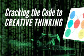
Picture this. A chaotic world of abstract concepts and complex data, like a thousand-piece jigsaw puzzle. Each piece, a different variable, a unique detail.
Alone, they’re baffling, nearly indecipherable.
But together? They’re a masterpiece of visual information, a detailed illustration.
American data pioneer Edward Tufte, a notable figure in the graphics press, believed that the art of seeing is not limited to the physical objects around us. He stated, “The commonality between science and art is in trying to see profoundly – to develop strategies of seeing and showing.”
It’s in this context that we delve into the world of data visualization. This is a process where you create visual representations that foster understanding and enhance decision making.
It’s the transformation of data into visual formats. The information could be anything from theoretical frameworks and research findings to word problems. Or anything in-between. And it has the power to change the way you learn, work, and more.
And with the help of modern technology, you can take advantage of data visualization easier than ever today.
What are Visual Representations?
Think of visuals, a smorgasbord of graphical representation, images, pictures, and drawings. Now blend these with ideas, abstract concepts, and data.
Bam!
You get visual representations. A powerful, potent blend of communication and learning.
As a more formal definition, visual representation is the use of images to represent different types of data and ideas.
They’re more than simply a picture. Visual representations organize information visually, creating a deeper understanding and fostering conceptual understanding. These can be concrete objects or abstract symbols or forms, each telling a unique story. And they can be used to improve understanding everywhere, from a job site to an online article. University professors can even use them to improve their teaching.
But this only scratches the surface of what can be created via visual representation.
Types of Visual Representation for Improving Conceptual Understanding
Graphs, spider diagrams, cluster diagrams – the list is endless!
Each type of visual representation has its specific uses. Mind map templates can help you create a detailed illustration of your thought process. It illustrates your ideas or data in an engaging way and reveals how they connect.
Here are a handful of different types of data visualization tools that you can begin using right now.
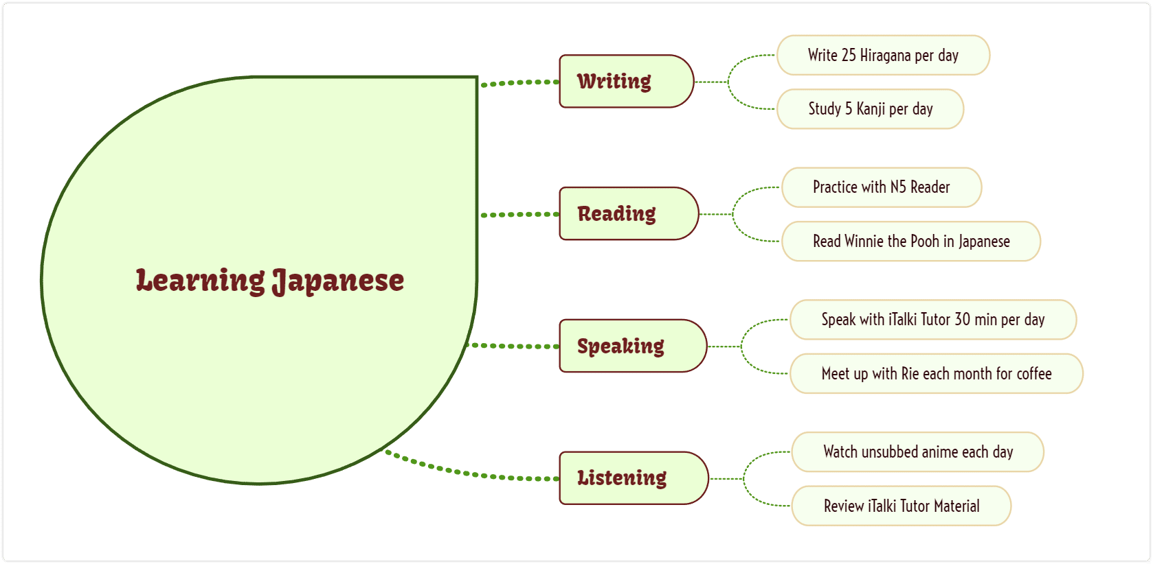
1. Spider Diagrams
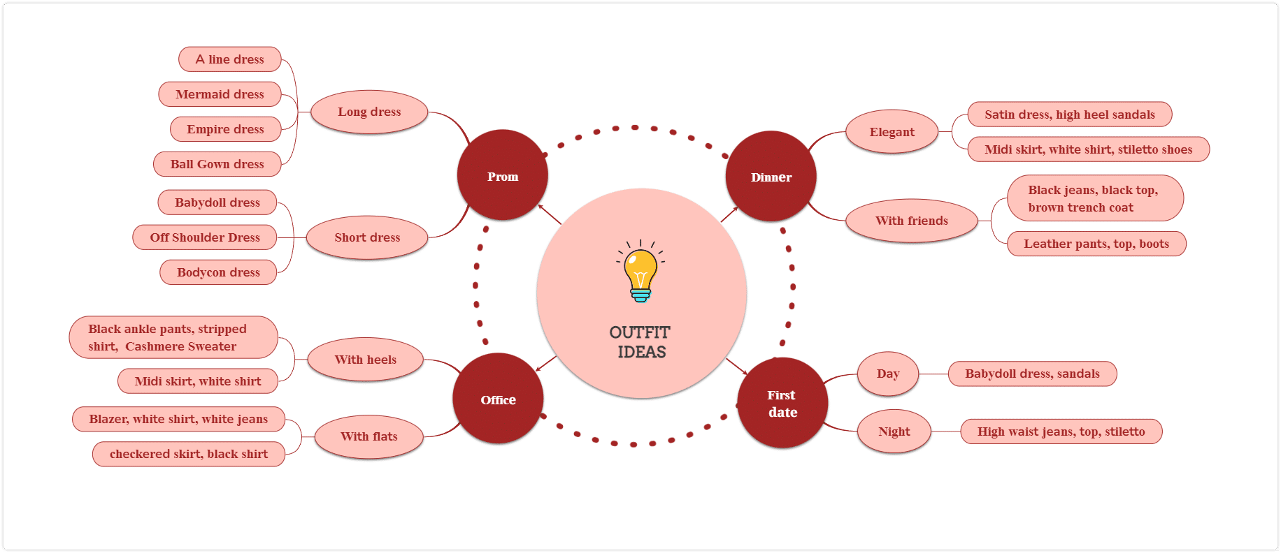
Spider diagrams, or mind maps, are the master web-weavers of visual representation.
They originate from a central concept and extend outwards like a spider’s web. Different ideas or concepts branch out from the center area, providing a holistic view of the topic.
This form of representation is brilliant for showcasing relationships between concepts, fostering a deeper understanding of the subject at hand.
2. Cluster Diagrams
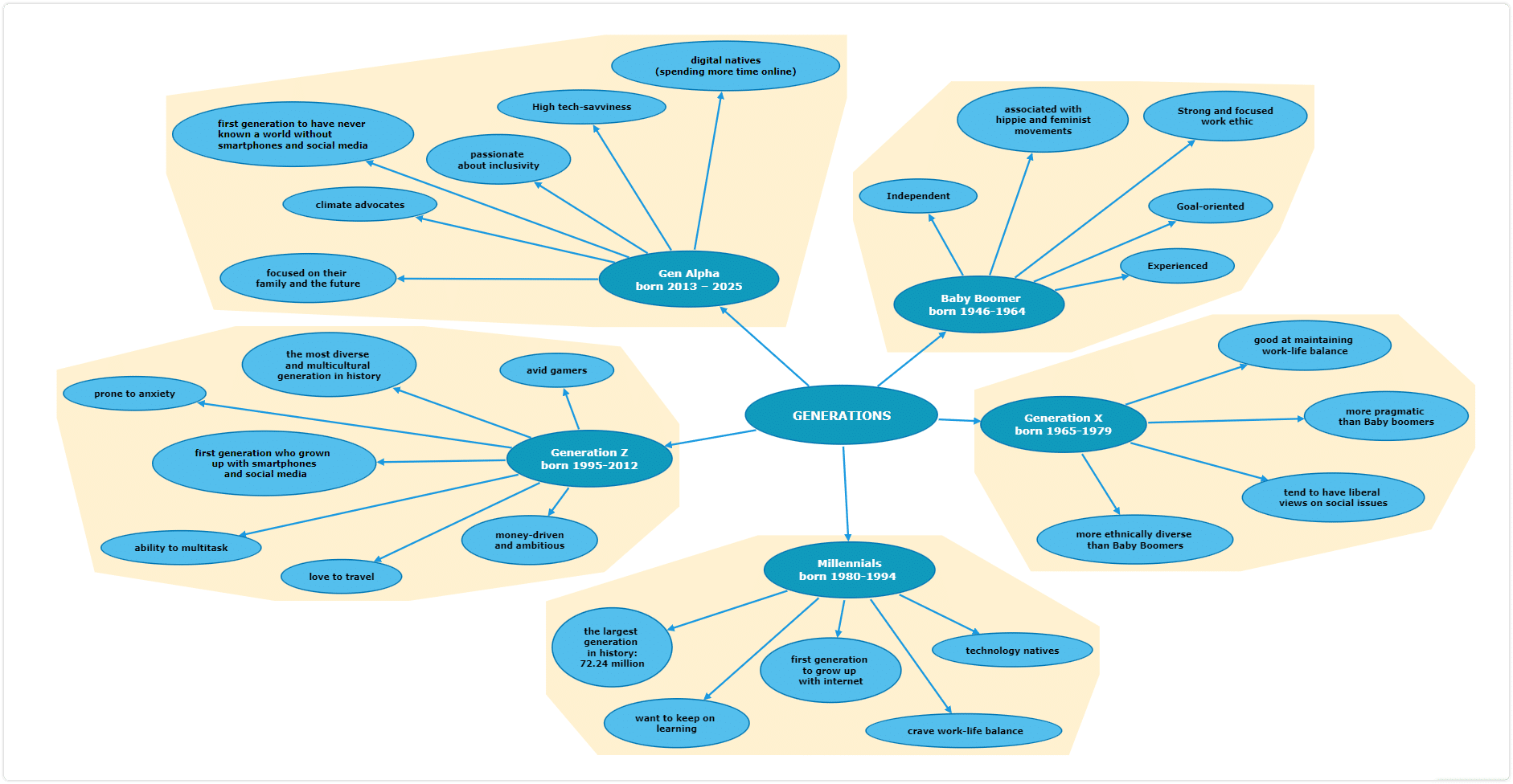
As champions of grouping and classifying information, cluster diagrams are your go-to tools for usability testing or decision making. They help you group similar ideas together, making it easier to digest and understand information.
They’re great for exploring product features, brainstorming solutions, or sorting out ideas.
3. Pie Charts

Pie charts are the quintessential representatives of quantitative information.
They are a type of visual diagrams that transform complex data and word problems into simple symbols. Each slice of the pie is a story, a visual display of the part-to-whole relationship.
Whether you’re presenting survey results, market share data, or budget allocation, a pie chart offers a straightforward, easily digestible visual representation.
4. Bar Charts

If you’re dealing with comparative data or need a visual for data analysis, bar charts or graphs come to the rescue.
Bar graphs represent different variables or categories against a quantity, making them perfect for representing quantitative information. The vertical or horizontal bars bring the data to life, translating numbers into visual elements that provide context and insights at a glance.
Visual Representations Benefits
1. Deeper Understanding via Visual Perception
Visual representations aren’t just a feast for the eyes; they’re food for thought. They offer a quick way to dig down into more detail when examining an issue.
They mold abstract concepts into concrete objects, breathing life into the raw, quantitative information. As you glimpse into the world of data through these visualization techniques, your perception deepens.
You no longer just see the data; you comprehend it, you understand its story. Complex data sheds its mystifying cloak, revealing itself in a visual format that your mind grasps instantly. It’s like going from a two dimensional to a three dimensional picture of the world.
2. Enhanced Decision Making
Navigating through different variables and relationships can feel like walking through a labyrinth. But visualize these with a spider diagram or cluster diagram, and the path becomes clear. Visual representation is one of the most efficient decision making techniques.
Visual representations illuminate the links and connections, presenting a fuller picture. It’s like having a compass in your decision-making journey, guiding you toward the correct answer.
3. Professional Development
Whether you’re presenting research findings, sharing theoretical frameworks, or revealing historical examples, visual representations are your ace. They equip you with a new language, empowering you to convey your message compellingly.
From the conference room to the university lecture hall, they enhance your communication and teaching skills, propelling your professional development. Try to create a mind map for research and compare it to a plain text document full of research documentation and see the difference.
4. Bridging the Gap in Data Analysis
What is data visualization if not the mediator between data analysis and understanding? It’s more than an actual process; it’s a bridge.
It takes you from the shores of raw, complex data to the lands of comprehension and insights. With visualization techniques, such as the use of simple symbols or detailed illustrations, you can navigate through this bridge effortlessly.
5. Enriching Learning Environments
Imagine a teaching setting where concepts are not just told but shown. Where students don’t just listen to word problems but see them represented in charts and graphs. This is what visual representations bring to learning environments.
They transform traditional methods into interactive learning experiences, enabling students to grasp complex ideas and understand relationships more clearly. The result? An enriched learning experience that fosters conceptual understanding.
6. Making Abstract Concepts Understandable
In a world brimming with abstract concepts, visual representations are our saving grace. They serve as translators, decoding these concepts into a language we can understand.
Let’s say you’re trying to grasp a theoretical framework. Reading about it might leave you puzzled. But see it laid out in a spider diagram or a concept map, and the fog lifts. With its different variables clearly represented, the concept becomes tangible.
Visual representations simplify the complex, convert the abstract into concrete, making the inscrutable suddenly crystal clear. It’s the power of transforming word problems into visual displays, a method that doesn’t just provide the correct answer. It also offers a deeper understanding.
How to Make a Cluster Diagram?
Ready to get creative? Let’s make a cluster diagram.
First, choose your central idea or problem. This goes in the center area of your diagram. Next, think about related topics or subtopics. Draw lines from the central idea to these topics. Each line represents a relationship.
While you can create a picture like this by drawing, there’s a better way.
Mindomo is a mind map maker that will enable you to create visuals that represent data quickly and easily. It provides a wide range of templates to kick-start your diagramming process. And since it’s an online site, you can access it from anywhere.
With a mind map template, creating a cluster diagram becomes an effortless process. This is especially the case since you can edit its style, colors, and more to your heart’s content. And when you’re done, sharing is as simple as clicking a button.
A Few Final Words About Information Visualization
To wrap it up, visual representations are not just about presenting data or information. They are about creating a shared understanding, facilitating learning, and promoting effective communication. Whether it’s about defining a complex process or representing an abstract concept, visual representations have it all covered. And with tools like Mindomo, creating these visuals is as easy as pie.
In the end, visual representation isn’t just about viewing data, it’s about seeing, understanding, and interacting with it. It’s about immersing yourself in the world of abstract concepts, transforming them into tangible visual elements. It’s about seeing relationships between ideas in full color. It’s a whole new language that opens doors to a world of possibilities.
The correct answer to ‘what is data visualization?’ is simple. It’s the future of learning, teaching, and decision-making.
Keep it smart, simple, and creative!
The Mindomo Team