Have you ever tried to make sense of a table full of numbers, only to find yourself lost in a sea of data?
Do you struggle to communicate complex information in a way that’s easy for others to understand?
Have you ever wondered whether there’s an easier way to persuade someone that your data matters?
If so, then you’re not alone.
As the amount of data available to us continues to grow exponentially, so does the need for effective ways to analyze and present that data. This is where data visualization comes in.
So, what is data visualization?
It’s a powerful tool that can help you make sense of complex data by presenting it in a clear, visual format.
With the help of data visualization tools, you can identify patterns and trends. Plus, you may discover insights that aren’t immediately apparent when looking at raw data.
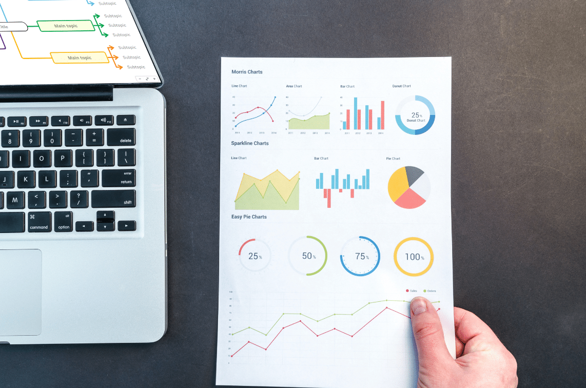
By using representing data visually, you can make data more accessible, understandable, and actionable for yourself and others. This is true whether you use a heat map, pie chart, bar graph, geospatial visualization, flowchart diagram, or any other visual representation.
In this article, we’ll give an in-depth answer to the question what is data visualization? Then, we’ll explore why it’s important and how it can benefit you and your business.
We’ll also introduce you to Mindomo. It’s a full-featured mind mapping software that can help you prepare, analyze, and present data in a clear, compelling way.
Whether you’re a data analyst, scientist, or business owner, this is vital information. It’ll help you make better decisions and communicate insights effectively.
So let’s dive in and explore the world of data visualization together.
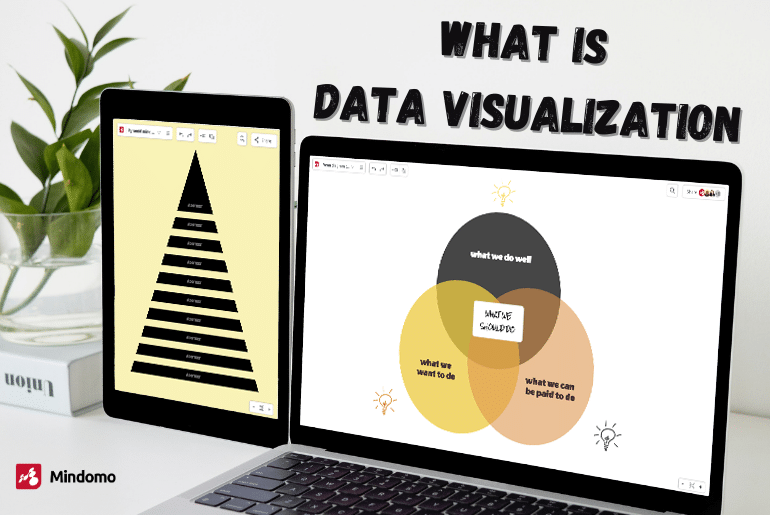
What is data visualization?
Effective data visualization can help you present data and communicate insights in a way that is clear and easy to understand. It also helps in performance metrics and identifying key performance indicators.
With the help of data visualization, you can represent data points and analyze data from multiple data sources, making it easier to analyze and understand data sets.
There are many types of data, including numerical values, categorical data, and hierarchical data. Data visualization helps in visualizing data and statistical graphics such as line graphs, bar charts, and pie charts. It also includes visualizing geospatial data and scientific visualization.
What are the 4 benefits of visualization?
Data visualization helps you in dozens of different ways. Here are four of the most powerful benefits of putting your data sets in a graphic format.
1. Data visualizations enable effective analysis and understanding of complex data sets
One of the most significant benefits of data visualization is that it enables effective data analytics of complex data sets.
You can convert numerical values and statistical graphics into visual formats such as bar charts, pie charts, and line graphs. Then, it will be easier to identify patterns and relationships that may not be immediately apparent.
Visual representations of data help individuals quickly analyze and gain insights from multiple data sources. This could include big data, hierarchical data, and other data sources.
2. Data visualizations improve communication and collaboration between teams
Data visualization also improves team communication and collaboration between team members.
Visualizing data helps individuals communicate complex information to others in a clear and concise manner. This is why it’s an important tool for business analysts, data scientists, and project management roles.
By presenting data in a visual format, individuals can easily share insights with others. This helps facilitate discussions about performance metrics, key performance indicators, and areas for improvement.
Interactive data visualization tools can also enable real-time collaboration and feedback. And with a diagramming tool like Mindomo, you can do it all in one place.
3. Data visualizations facilitate informed decision-making based on data insights
Data visualization facilitates informed decision-making based on data insights and easier data analysis.
By presenting data in a visual format, individuals can easily compare and contrast data points, identify correlations, and draw conclusions. This can be especially helpful in identifying patterns in web traffic, behavioral data, and other categorical data.
Visualization methods such as heat maps and bar graphs can help identify areas for improvement and streamline processes. This makes deep data analysis, predictive analytics, and machine learning possible.
4. Data visualization helps you tell better stories
Data visualization can create a powerful visual impact that captures the audience’s attention and engages them in the data.
Visual representations of data, such as graphs, charts, and maps, are much more memorable and impactful than dry spreadsheets or tables of numbers.
Data visualization can help facilitate comparison between different data points or categories. For example, a bar chart can easily show the relative performance of different products, regions, or time periods.
This makes it easier to identify areas of strength and weakness and to tell a more compelling story about the data.
Other advantages of data visualization
In addition to these four main benefits of data visualization, data visualizations also offer the following advantages:
Provides a holistic view of data
By presenting data in a visual format, individuals can quickly gain a holistic view of the data. It helps them identify trends, outliers, and patterns that would be difficult to discern from numerical values alone.
Improves data accuracy
Data visualization tools can help identify errors and inconsistencies in data, ensuring greater accuracy and reliability of results.
Facilitates exploratory data analysis
Data visualization tools allow users to explore data and uncover insights that may not have been immediately apparent.
Encourages data-driven decision-making
By making data more accessible and easy to understand, data visualization tools can help organizations make more informed, data-driven decisions.
Supports data transparency
Data visualization can help organizations be more transparent with their data. How? By presenting it in a way that is easy to understand and accessible to stakeholders.
Enables real-time monitoring
Certain data visualization tools can enable real-time monitoring of data. This makes it possible to quickly identify and respond to changes in performance metrics.
Improves data literacy
Data visualization can help individuals develop their data literacy skills. This enables them to better understand and analyze complex data.
Supports data-driven innovation
By making it easier to identify trends and patterns in data, data visualization can help drive innovation. It can also create new opportunities for growth and development.
Improves customer satisfaction
By using data visualization to track customer behavior and preferences, organizations can improve customer satisfaction. And they can create a more personalized customer experience.
Which tool is best for data visualization?
There are hundreds of data visualization tools and graphic organizers out there if you’re looking to have your data displayed. But not all tools are created equal. Some require more advanced data visualization skills than others. And they don’t all offer the same value for the money.
So, which data visualization tool is the best?
Mindomo is a full-featured data visualization tool that can help you prepare data for analysis and create interactive data visualizations.
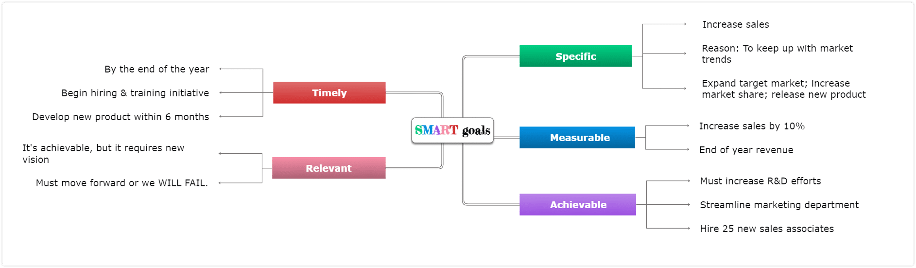
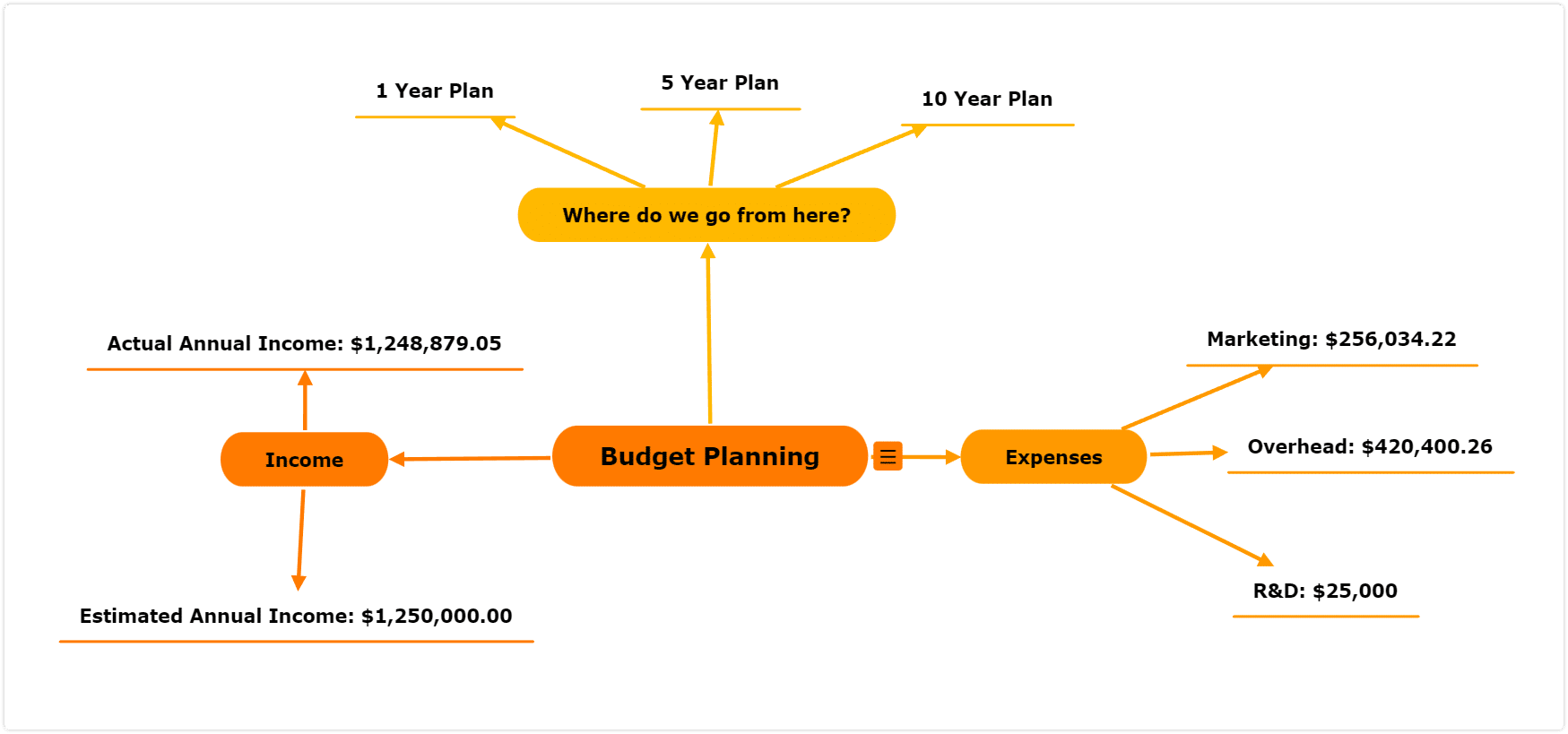
It offers the ability to create many different kinds of mind maps, presentations, timeline diagrams, Venn diagrams, funnel diagrams, and visualizations. It also allows users to drill down on specific branches of a mind map. So you can create a more effective data visualization that offers deeper analysis.
In addition, you can customize the look and feel of their visualizations using colors, fonts, images, and more. You can even add links to create an interactive visualization.
One of the most important aspects of data visualization is visual communication. With the help of data visualization, you can represent the same data in different ways, allowing users to gain a deeper understanding of the data presented. This is especially useful in identifying patterns and presenting data in graphical form when dealing with two variables or multiple categories.
And Mindomo also gives you the ability to create presentations. Data visualization helps persuade stakeholders that you’ve got big data that matters. And best of all, you don’t have to be a data scientist to make it happen. Moreover, you can also use this diagram software for education and organize your personal life.
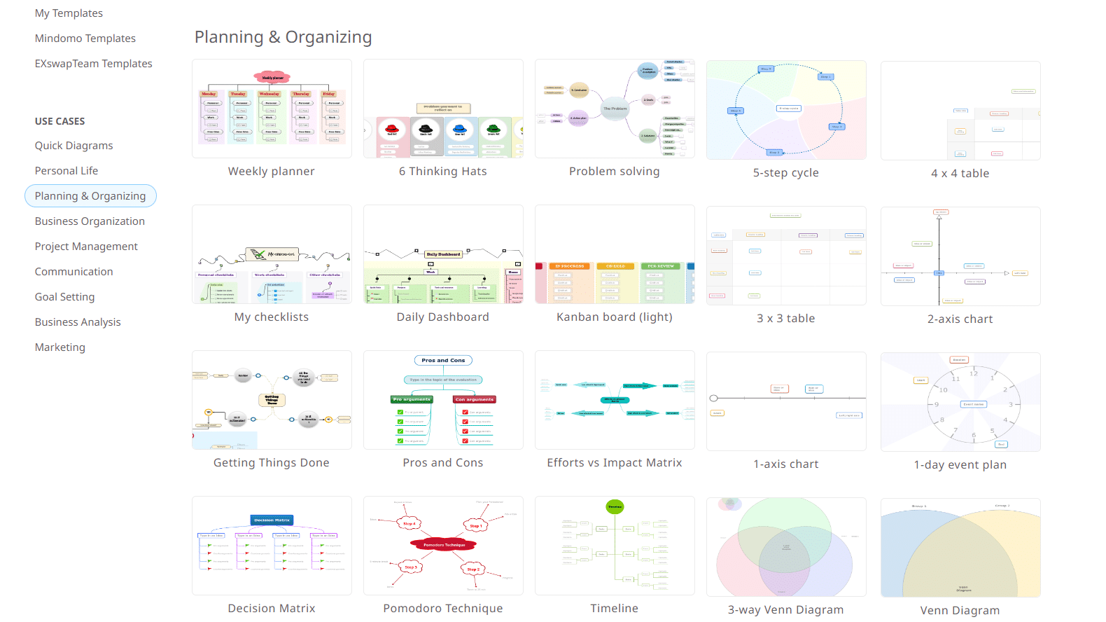
You have many templates available to begin with:
If you’re ready to start analyzing data visually and presenting it, look no further than Mindomo. Get all of the above benefits and more by visiting our website and trying it out completely free.
Keep it smart, simple, and creative!
The Mindomo Team