Data is everywhere.
It powers the internet and pulses through your smartphone. It’s the lifeblood of every piece of hardware or app. It drives business decisions. It’s used to persuade, inform, and communicate.
Why is organizing information from viewing important?
And yet, data isn’t always easy to understand. Depending on the kind of information you’re dealing with, it can be unwieldy and cumbersome. Communicating ideas effectively can feel practically impossible.
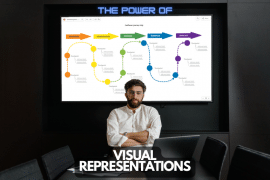
That’s why visuals are so powerful for organizing and communicating complex ideas. A picture – as they say – is worth 1,000 words.
What is data visualization?
By organizing data visually, you can make complex information more accessible, understandable, and memorable.
This has never been more important than in today’s world. We are inundated with information from all directions. And the ability to visualize and present data in a clear, concise way is more important than ever.
What is the most effective way to organize information?
In this article, we’ll explore the best ways to organize information visually for different types of data. We’ll look at geographic and location information, alphabetic information, chronological information, hierarchical information, categorical information, and more.
We will discuss various mind map types and techniques that can be used to represent information visually. We’ll cover mind maps, concept maps, organizational charts, Venn diagrams, T-charts, and timelines. And by the end of this article, you’ll understand how to visually organize any type of information. That way, you can create a powerful and engaging visual representation that’s memorable and effective.
1. Organize Geographic & Location-Based Information
Location information refers to data related to physical places, such as cities, buildings, or landmarks. The visual representation of location information can be crucial for understanding and analyzing patterns and relationships between places.
It also makes it easier to make informed decisions.
Use Maps to Organize Data
Using graphic organizers such as maps can help to organize location information in a visual way. Maps can range from simple diagrams to complex visual representations that convey data such as population density, topography, or transportation routes.
For example, a map could be used to visualize the distribution of customers for a business. Different regions could be color-coded to indicate the number of customers in each area.
Another example could be a map used to analyze the spread of disease. Dots could represent the location of each confirmed case. And color-coding could be used to indicate the severity of the outbreak in each area.
You can also use these maps for personal purposes, for example, to mark the countries where you traveled so far.
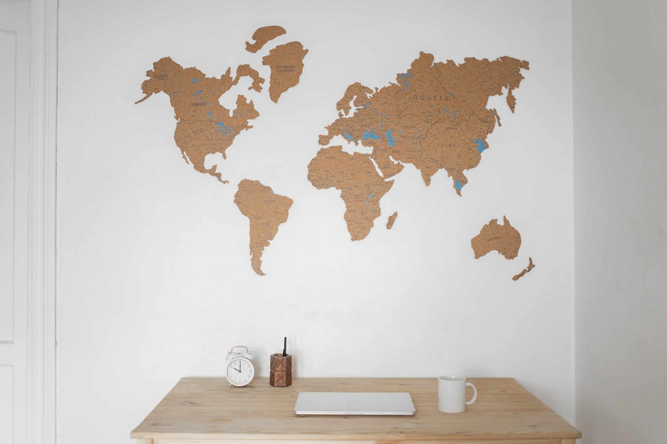
This kind of graphic organizer could help identify patterns, relationships, and opportunities that might not be immediately apparent from raw data. You can use graphic organizers to visualize location data for business, scientific research, personal uses, and more. Doing so will help you analyze, communicate, and understand the data better.
2. Organize Information in Alphabetical Order
Alphabetic information refers to data that is arranged in alphabetical order, such as lists of names, words, or titles. Alphabetic information is inherently organized. But visual representation can help to highlight specific patterns, connections, and relationships that might not be immediately apparent.
UseT-charts to Organize Data
Using graphic organizers such as T-charts or two columns can be an effective way to visually organize alphabetic information. T-charts are often used to compare and contrast information. One column can be used for similarities and the other for differences. Two columns can be used to categorize information, with one column for each category.
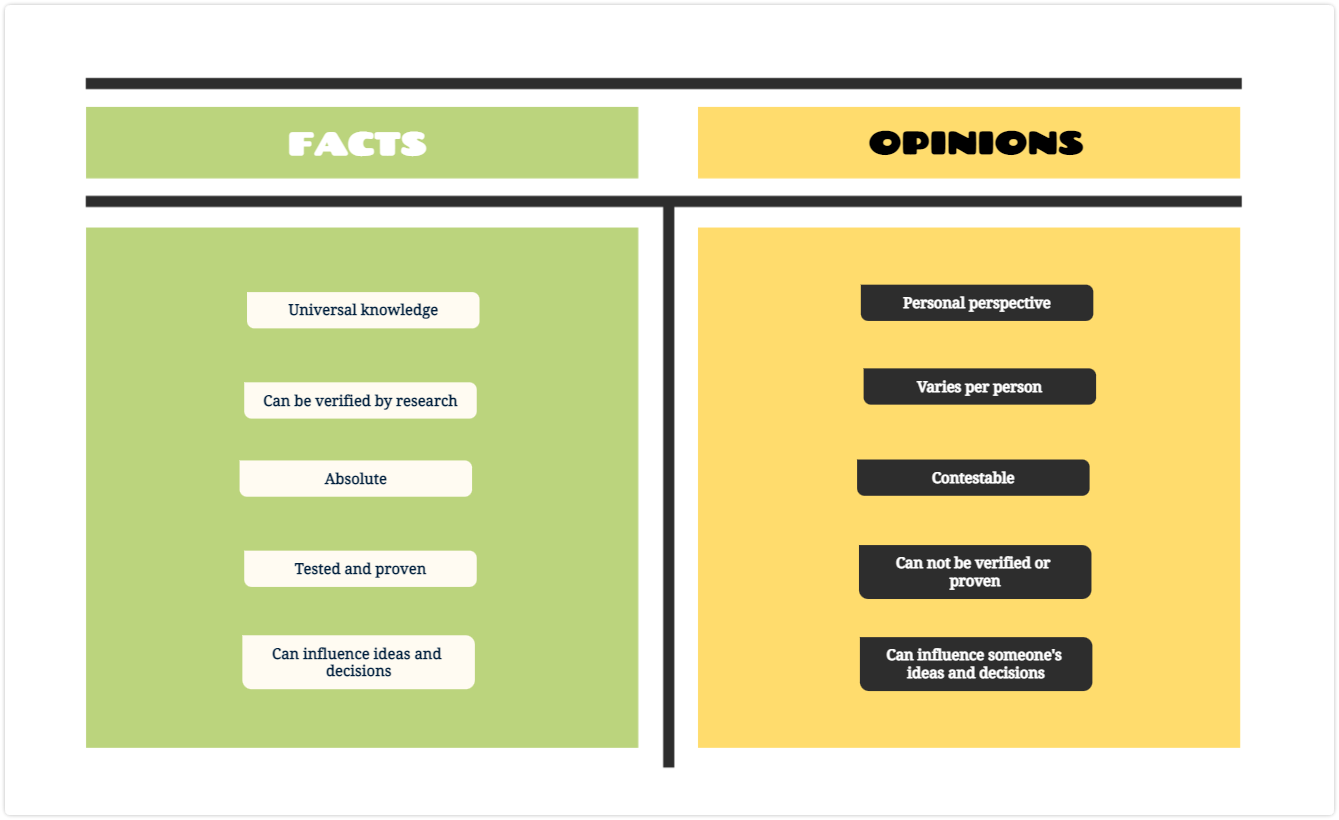
For example, a T-chart could be used to compare two products or services. You could list the similarities in the middle and the differences in the outer columns. Or a two-column chart could be used to categorize a list of books by genre.
Overall, the use of visual representation for alphabetic information can help to make connections and patterns more explicit. They can also improve your ability to understand and analyze the data.
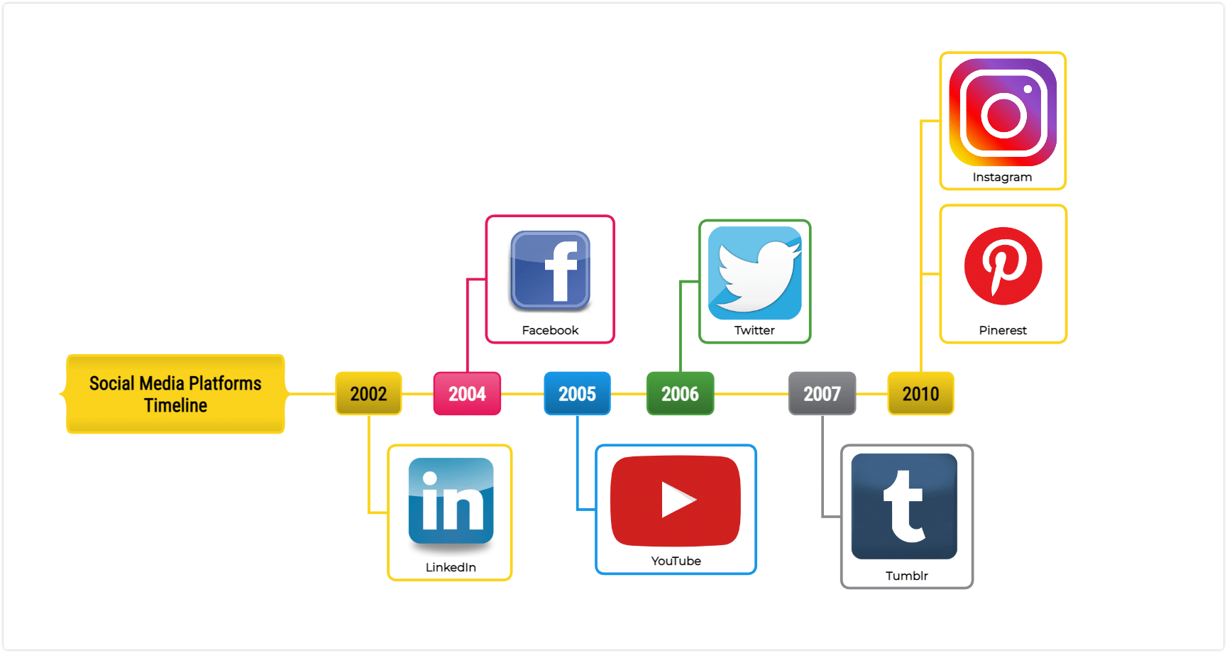
3. Visually Organize Information Related to Chronology
Chronological information refers to data that is organized by time. This could include historical events, project timelines, or a sequence of steps in a process. The visual representation can be especially helpful for organizing chronological information, as it can help to identify patterns, relationships, and dependencies.
Use Timelines & Flowcharts to Organize Data
Using graphic organizers such as timelines and flowcharts can be an effective way to visually organize chronological information. Timeline diagrams can be used to represent the progression of events or milestones over time. Flowchart diagrams can be used to show the sequence of steps in a process.
For example, a timeline could be used to show the major events leading up to a particular historical period. You could add important dates and events along the timeline.
A flowchart could be used to represent the steps in a manufacturing process. You could label each step and connect them with arrows to indicate the flow of the process.
Overall, the use of visual representation for chronological information can help to clarify the sequence of events. Or identify patterns and dependencies. Or highlight potential areas of improvement. Or accomplish a number of other tasks.
4. Organize Hierarchical Information
Hierarchical information refers to data that is organized in a hierarchical or nested structure. This includes everything from organizational structures and family trees (family genograms) to classification systems.
Visual representation can be particularly useful for organizing hierarchical information. It can help to visualize the relationships and connections between different levels of the hierarchy.
Use Organizational Charts & Tree Diagrams
Using graphic organizers such as organizational charts (organigram) and tree diagrams can be an effective way to visually organize hierarchical information.
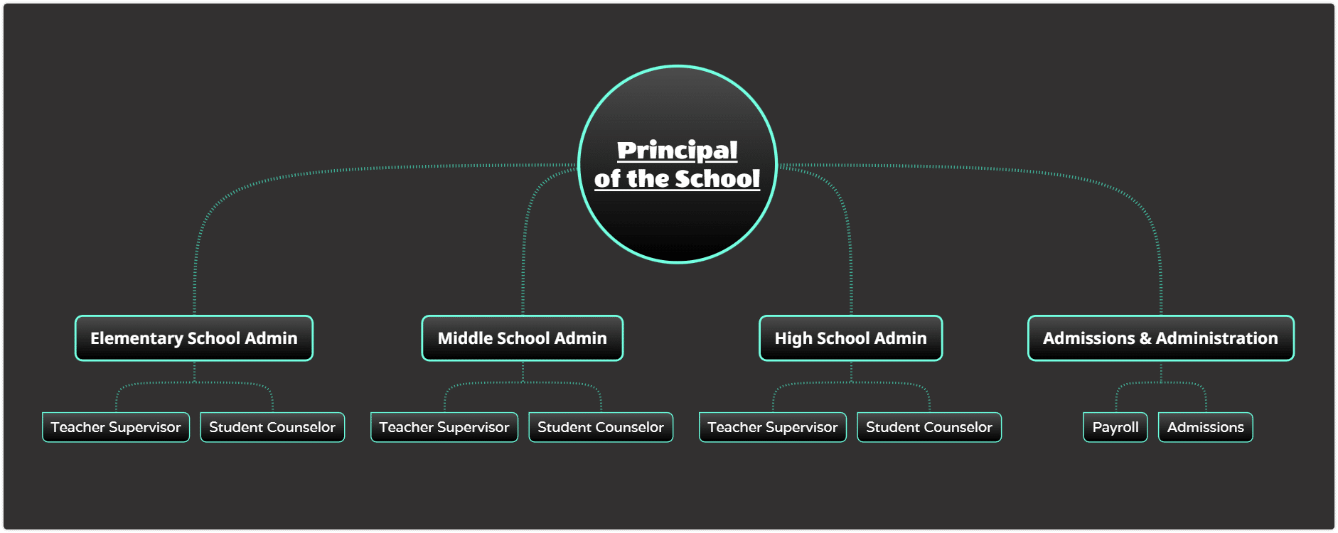
Organizational charts can be used to show the structure of an organization. You can clarify different levels of hierarchy using different levels of the chart.
Tree diagrams can be used to represent the hierarchy of a classification system. You can easily make a tree diagram online representing the top level at the root of the tree and subsequent levels branching out from it.
For example, an organizational chart could be used to show the management structure of a company. The CEO would be at the top, and different departments and managers would be represented at different levels below.
A tree diagram could be used to represent the classification of different species in biology. The kingdom would be at the root. Then, you could add subsequent levels representing phyla, classes, orders, families, genera, and species.
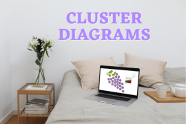
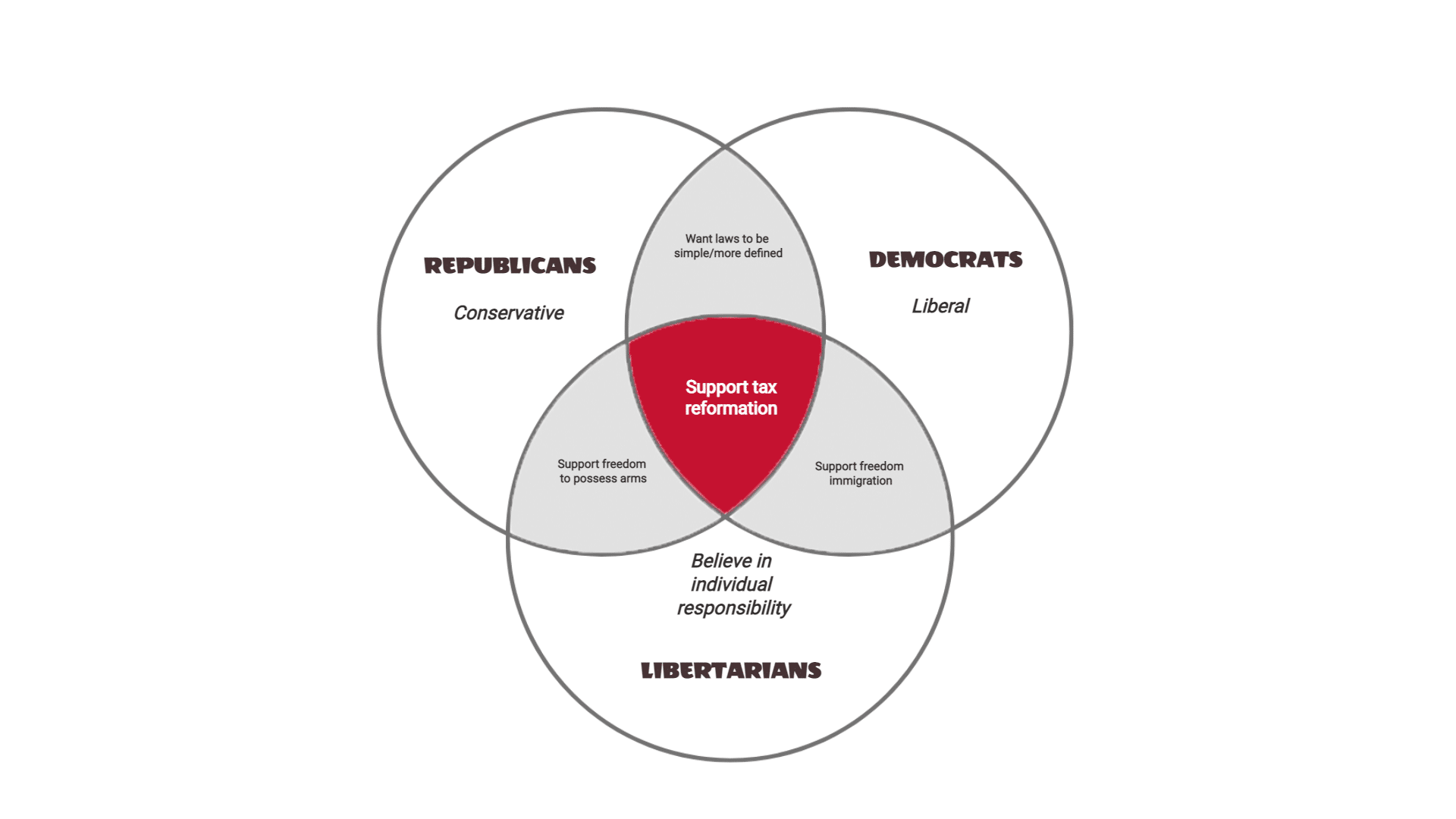
5. Organize Categorical Information
Categorical information refers to data that is organized into categories. This could include types of products, different types of animals, or groups of people based on demographic characteristics.
Visual representation can be particularly useful for organizing categorical information. It can help to compare and contrast different categories and identify relationships between them. It can also connect ideas that you might otherwise miss.
Use Venn Diagrams to Organize Information
Using graphic organizers such as Venn diagrams and concept maps can be an effective way to visually organize categorical information.
Venn diagrams can be used to show the overlap and differences between different categories. Each category can be represented as a circle, and the overlap between them represents the commonalities. You can use two or more circles to create a Venn diagram.
Concept maps can be used to show the relationships between different categories. You can put the main concept or category in the center. Then, make sure you have the central idea surrounded by subcategories and other ideas.
A Venn diagram could be used to compare and contrast different types of cars based on their features. Each type of car would be represented as a circle, and the overlap between them would clarify the common features.
A concept map could be used to show the relationships between different types of animals. The main categories of mammals, birds, fish, and reptiles would be in the center. Related subcategories or species would be connected around them.
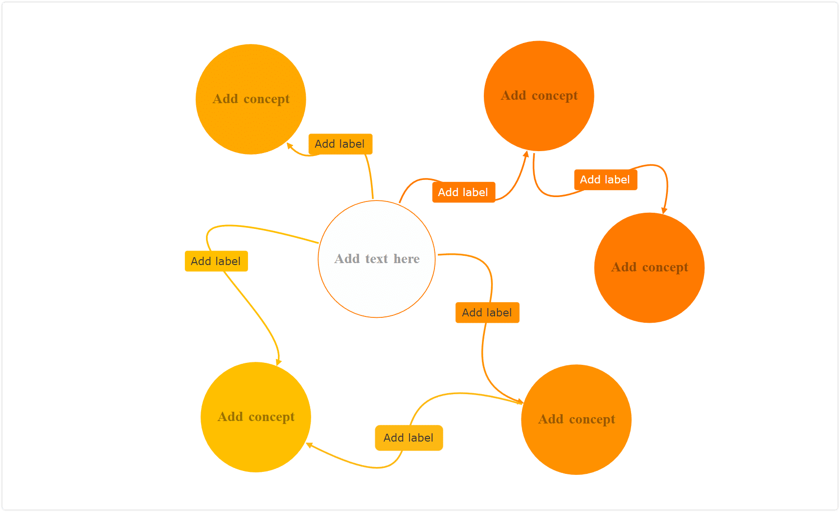
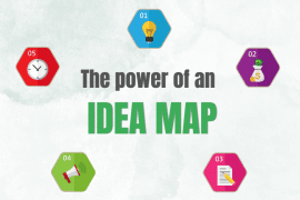
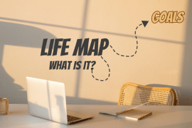
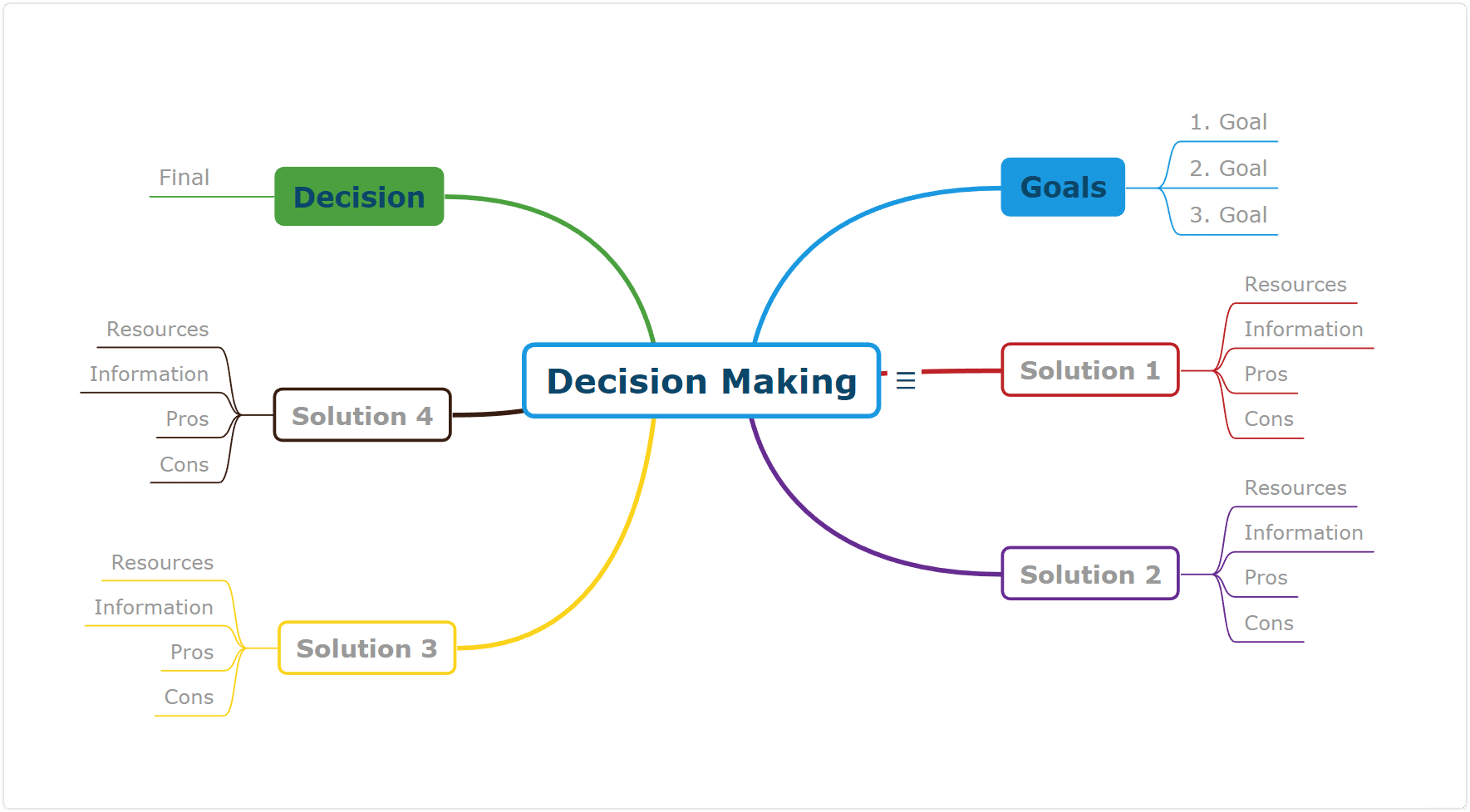
Use a Mind Map to Organize Data
Mind mapping is a powerful tool for visually organizing information. A mind map is a diagram that represents ideas, tasks, or other items arranged around a central idea or topic. The idea is to use a central image or concept to stimulate thinking and organize information. When you’re done, you’ll have a network of ideas connected to the main idea.
Using mind maps for visual organization offers many benefits, including:
- Clarity: Mind maps provide a clear and concise visual representation of complex information. They can help you to quickly and easily identify relationships and connections between ideas.
- Creativity: Mind mapping can help to stimulate creativity and generate new ideas. By exploring different connections and relationships between ideas, you can come up with innovative solutions to problems.
- Memory retention: Mind maps are a great tool for retaining and recalling information. Using visual and spatial cues, they help to improve the recall and retention of information.
When creating a mind map, it’s important to follow a few key tips to ensure that the map is effective and easy to understand. These tips include:
- Selecting a central idea: Choose a central idea or topic that is relevant to the information you want to organize.
- Surrounding it with related ideas: Add related ideas and concepts around the central idea, using shapes or symbols to represent each idea.
- Using visual hierarchy and groupings: Use visual hierarchy to distinguish between different levels of information. This can be achieved by using different colors, font sizes, and shapes. Group related ideas together to make it easier to understand the relationships between them.
Mind maps can be used for a variety of purposes. You can use them to brainstorm ideas, organize notes, plan projects, or explore complex topics.
Gestalt Principles & Organizing Data Visually
Gestalt principles are a set of principles that explain how we perceive visual information. These principles can be applied to the visual organization to create effective and visually appealing representations of information.
Some of the most important Gestalt principles include proximity, similarity, closure, continuity, and figure-ground. You can use these principles to organize your data more effectively.
Proximity
Proximity refers to the idea that elements that are close together are perceived as related. This principle can be used to group related information together in a visual representation. For example, in a mind map, related ideas can be grouped together in the same branch or cluster.
Similarity
Similarity refers to the idea that elements that are similar in appearance are perceived as related. This principle can be used to create visual hierarchy by making the most important information stand out through color, size, or shape.
Closure
Closure refers to the idea that our minds tend to complete incomplete shapes or patterns. This principle can be used to create visual representations that are easy to understand by using simple shapes and patterns.
Continuity
Continuity refers to the idea that our minds tend to perceive visual elements as continuous lines or patterns. This principle can be used to create visual representations that flow naturally and are easy to follow.
Figure-Grounded
Figure-ground refers to the idea that we tend to perceive objects as either the foreground or background. This principle can be used to create visual representations that highlight the most important information by making it stand out against a neutral background.
Gestalt principles can help you create effective and visually appealing representations of information that are easy to understand and remember.
A Few Closing Words
This article has explored the best ways to organize information in a visual format. We’ve discussed how graphic organizers can be used to visually represent these types of information effectively.
Furthermore, we have discussed the benefits of using mind maps for visual organization. We’ve shown how they can help you brainstorm ideas and more. Additionally, we have explored how to apply Gestalt principles to the visual organization. This includes the use of proximity, similarity, continuity, closure, and figure-ground relationships.
In conclusion, organizing information visually is a crucial skill for conveying information effectively. By using a diagramming tool like Mindomo and Gestalt principles, you can create effective visual representations of information. They’ll help you communicate your message clearly and efficiently.
If you’d like to get started organizing your data with effective visuals, try Mindomo today.
Keep it smart, simple, and creative!
The Mindomo Team